With cordite in the air, splintered steel, shell casings and powder burns, there’s only one explanation...
For all you mappers out there!

Moderators: Joe Kari, Pardner, TheDoctor, Breli

br_comanchecanyon **WIP**

Postby Pardner » Wed Oct 13, 2010 9:11 pm

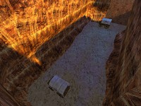
I learned my lesson (I hope) in making Lago. Lago is a poor design for frame rate as well as gameplay. My next map I want to be good for both while still being pleasing to the eye. I've started a new map, one that Red and I have been talking about for a while. I am making a long canyon style map with pure terrain for cover.

***DOWNLOAD MAP HERE***

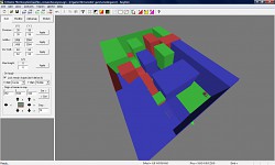
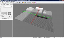
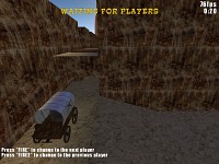
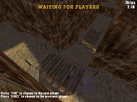
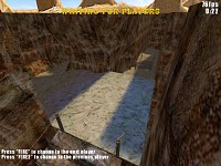
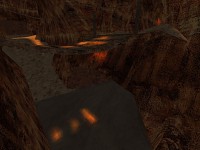
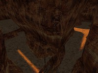
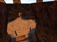
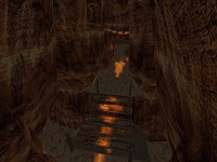
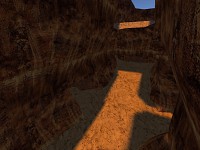
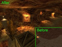
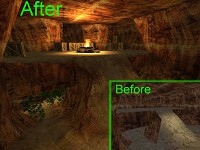
Here are screens from all stages of the development:
Image Image

Image Image

Image Image

Image Image Image

Image Image Image

Image Image Image

Image Image Image
Image Image Image

Please feel free to post initial comments here. I would like some general feedback on the map layout. Everything in the map is subject to change.
Last edited by Pardner on Sun Jul 03, 2011 10:37 pm, edited 14 times in total.

Image
Image
User avatar
Pardner
SG Team
 
Posts: 1786
Joined: Fri Nov 18, 2005 5:48 am
Location: MD, USA


Postby LuckyGenDago » Wed Oct 13, 2010 10:28 pm

Hey Pard

Sorry but i don't feel well with that map.
Fps Drop always Down if sky appiers up to me.
And a litle bit more round and nature Brushes and Rocks Hills etc. I hoepe it will change with easygen terrain.
But interesting idea.

Greetings
Dago
[IngameName] mS.Dago
TS Admin
Image
LuckyGenDago
Gunslinger
 
Posts: 139
Joined: Fri Apr 10, 2009 1:05 am


Postby ^SDE^Evans » Thu Oct 14, 2010 1:36 am

Cool!
But ... I think I could have more entries in the maps .. and more detail in some parts ... such as shares Underground ... small "lake" (similar to dm_canyon) ... and some buildings ... : D

I saw a "rock" big gray ... I guess you could remove it ... was not very good .. and the appearance was strange: D :roll:
I hurt myself today (8)
User avatar
^SDE^Evans
Shootist
 
Posts: 75
Joined: Sat Jun 05, 2010 2:24 pm
Location: Brazil


Re: br_comanchecanyon **WIP**

Postby Pardner » Thu Oct 14, 2010 2:04 am

Pardner wrote:And please note: this is only a few hours of work and is no where even remotely close to being complete. Here is a list of things I plan:
  • A tunnel system is in the works, but I haven't completely decided where it will go.
  • EasyGen terrain
  • Hand man cliff walls like in Lago. The size of the canyon paths may be reduced when the cliff walls are implemented.
  • Items to hide behind in the canyon (indents in the canyon wall, boxes, rocks, trees, etc).
  • Camp site at the defender's and the robber's spawn


I guess I was looking more for gameplay suggestions. I know it lakes detail, i know there are random brushes here and there, I know it needs more work. Seriously, that is about 2 hrs of work our of 100 needed for a map.....

I guess the point is, I don't want to make a map if it will never be played. Releasing a map design before I fully commit allows me to get an understanding of what I could do better.
User avatar
Pardner
SG Team
 
Posts: 1786
Joined: Fri Nov 18, 2005 5:48 am
Location: MD, USA


Postby LuckyGenDago » Thu Oct 14, 2010 11:50 am

Hello P

Do the Downparts more natural it allways looks so strange in the sg maps
i willtr to do one for example.

Greeting
Dago
[IngameName] mS.Dago
TS Admin
Image
LuckyGenDago
Gunslinger
 
Posts: 139
Joined: Fri Apr 10, 2009 1:05 am


Postby Pardner » Thu Oct 14, 2010 1:48 pm

LuckyGenDago wrote:Hello P

Do the Downparts more natural it allways looks so strange in the sg maps
i willtr to do one for example.

Greeting
Dago

You do realize that all those brushes will be replaced by a nice EG terrain and handmade cliff walls.... see the slopes and terrain of Lago for an example. I know it looks stange.... what do you expect for 2 hrs of work. Trust me when I say that it will look much much better once I get the layout finalized. The reason I posted this was to test the layout.

EDIT: This is what I am interested in:

What do you think if I move the lower entrance over to the right and make the upper entrance slope down to the defender spawn? The upper entrance I make like that because I wanted the robbers to have an advantage sniper spot as the defender spawn is easy to guard do to the size.
From this:
Image

To this:
Image
User avatar
Pardner
SG Team
 
Posts: 1786
Joined: Fri Nov 18, 2005 5:48 am
Location: MD, USA


Postby MsH » Thu Oct 14, 2010 4:31 pm

Nice idea Pardner! :P I like it.
User avatar
MsH
Gunslinger
 
Posts: 154
Joined: Sun Jun 06, 2010 8:44 pm


Postby LuckyGenDago » Thu Oct 14, 2010 8:50 pm

You mean that the defenders can up there fast`?
[IngameName] mS.Dago
TS Admin
Image
LuckyGenDago
Gunslinger
 
Posts: 139
Joined: Fri Apr 10, 2009 1:05 am


Postby Pardner » Thu Oct 14, 2010 9:39 pm

LuckyGenDago wrote:You mean that the defenders can up there fast`?

No, I mean the defended spawn seems to be easy to defend... I added that nice little camping spot for the robbers. The defenders would have to expose themselves in order to get up there.
User avatar
Pardner
SG Team
 
Posts: 1786
Joined: Fri Nov 18, 2005 5:48 am
Location: MD, USA


Postby ChainLightnin' » Thu Oct 14, 2010 10:33 pm

That would seem right. This map would challenge your spacial awareness!
Well...Mr. Chain Blue Lightnin' hisself..heh, heh!
User avatar
ChainLightnin'
Gunslinger
 
Posts: 389
Joined: Fri Jun 09, 2006 4:09 am
Location: Montana


Postby Pardner » Fri Oct 22, 2010 6:45 pm

LuckyGenDago wrote:Do the Downparts more natural it allways looks so strange in the sg maps


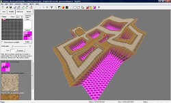
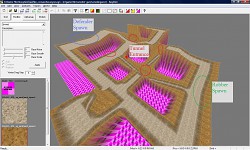
So I've spent some time in EasyGen laying out the paths:
Image
I need to tweak them for a more natural look. Then I will import the EG map into Radiant, and then start the long process of hand making cliff walls (like this)

Here is another angle with a labels where the defender spawn, robber spawn, and tunnel entrances will be.
Image
User avatar
Pardner
SG Team
 
Posts: 1786
Joined: Fri Nov 18, 2005 5:48 am
Location: MD, USA


Postby ^SDE^Evans » Sun Oct 24, 2010 1:39 am

woww...very cool!
I hurt myself today (8)
User avatar
^SDE^Evans
Shootist
 
Posts: 75
Joined: Sat Jun 05, 2010 2:24 pm
Location: Brazil


Postby Pardner » Wed Dec 29, 2010 9:02 pm

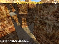
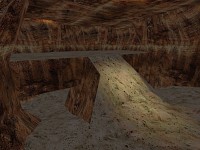
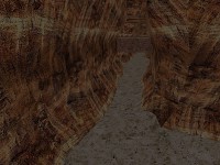
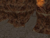
I've had some more time to work on this map. I've added the nice EG terrain to the blocky canyon layout, I've made detailed rope bridges, and I've started to make nice rock corridors. Screens? Yes please.

Image Image Image
I need to do a lot more more on the rock corridors. They still look a little blocky, but that may change when I apply phong shading. I plan to do manual texture blending, and a cave/tunnel section as well.
User avatar
Pardner
SG Team
 
Posts: 1786
Joined: Fri Nov 18, 2005 5:48 am
Location: MD, USA


Postby Sucalakafufu » Wed Dec 29, 2010 11:25 pm

Pardner wrote:I've had some more time to work on this map. I've added the nice EG terrain to the blocky canyon layout, I've made detailed rope bridges, and I've started to make nice rock corridors. Screens? Yes please.

Image Image Image
I need to do a lot more more on the rock corridors. They still look a little blocky, but that may change when I apply phong shading. I plan to do manual texture blending, and a cave/tunnel section as well.


looks like its coming together Pardner :D
SG Name: Sucalakafufu
Clan: [CWNN] - Clan With No Name
User avatar
Sucalakafufu
Gunslinger
 
Posts: 239
Joined: Thu Apr 16, 2009 8:59 am


Postby Mart Duggan » Wed Jan 05, 2011 4:07 am

I have never drawn a map but after a few months of playing this game I have a few ideas of what to put and not to put in a map to make it more playable.

Lag - is critical. Whatever causes it I would avoid as much as possible. Sound effects seem to slow fps. Maps with no sound like the Fort are popular.

Levels - basements or tunnels, and rooftops give a three dimensional aspect to a map. Dry Gulch is perfect example.

Lighting - big problem for me. My eyes do not adjust quickly from dark to light, neither do they pick up low contrast objects well. Maps with few deep shadows, decent contrast. Muddled or dark maps like Coyote Bluff are to be avoided in my opinion. Well lit maps (but please no harsh sun) are more playable

Size - I would assume the larger a map the more it lags. Regardless you can get lost on some maps. Think Backwater.

Spawn points - critical to gameplay in DM is where do you start? Too far from the action, takes forever to find anybody. Also don't like being dropped out in the open, that promotes spawn killing. Tillian is bad for that but hard to avoid, it is so open. An example of a bad spawn point is in the Mine, where one is dropped below the windmill across from the row of buildings (usually full of campers like me). This is going to be a BR map, but a BR map can be very playable for DM if designed well. I like BR Mexico for example.

I am sure you know all of this already, but I needed a break from playing SG. :D
User avatar
Mart Duggan
Gunslinger
 
Posts: 168
Joined: Wed Apr 21, 2010 5:38 pm


Next

Return to Level Editing

Show Sidebar
Show Sidebar

User Control Panel